News - New" Best Settings For Warzone 2 Ranked Play. Warzone 2 Graphics, Controller, Console, Pc

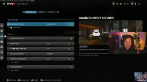
With that slide cancel, it feels so much better, and you never need a dolphin dive; literally, a dolphin dive just gets you killed, so you do not need to run that whatsoever. Now back over to the rest of the settings so plunging underwater free parachute Auto deploy off that's more of a war zone thing sprinting door bash on ledge climb Behavior Mansel only, combat behaviors hold, change Zoom activations Sprints a lot of this stuff doesn't really matter equipment behavior on hold weapon Mount activation ads plus medal weapon now exit delay, off tactical stance activation, off you really don't ever need a tactical stance I wish that wasn't even in the game because it genuinely doesn't even help you interact reload behavior for war zone prioritize interact for multiplayer make sure it's on tap to reload.
Best graphics settings

Off vram, scale Target. I know most people have it on 90. I'm a streamer, and I have a lot of other things running, so I need to have it on 80. If I had a dual PC setup, I would have it on 90-variable-rate shading. I have mine on, and then texture resolution is normal. You could put on low and you'll get more frames, but I found that's a little bit hard to see the enemies.
Usually since I'm streaming, I want my game to look good, so I'm going to have it on high, but for you, you might want to keep it on normal texture filter anatrophic. That doesn't matter, so the low depth of the field is insanely important. Make sure that's on off-detail quality level. If we look at the quality over here, if I remove my face cam, you guys can see that if you have it on low, you're actually going to see more of the plants; if you have it on low, you're going to see less of the plants, so you actually get better visibility.

If you have it on low, particle resolution, very low bullet impacts on you have better frames I think if you have an off but I just like to have it on persistent effects off Shader quality you actually have better like view, of the map when you have this on high if you look at that left picture compared to the right one the right one you have a little bit better visibility so make sure that's on high onand texture streaming off local texture streaming quality low Shadow quality Ultra I just found that's a little bit easier to see the enemies Shadow or like their gun Shadow and just overall, see the map a little bit more clearly if we have it on Ultra, basically we're going for visibility and FPS we want the computer to run well but also be able to see the enemies very consistently, if you want your camos to look good make sure this is on high so I'm going to put it back on high since I'm streaming, otherwise you have it on off Ambia inclusion off screen space Reflections.

If you want your camos to look good make sure it's on high if you don't really care about that make sure it's on off Static reflection quality we're going to have that on low doesn't really matter tessellation off volumetric quality low, you actually can see a little bit more of the map when you have it on low like there's less of those beams so you have better visibility on low the first physics quality off weather grid volumes low water quality on off now let's go over to the view settings field of view if you're playing war zone because the map's so big you're going to want to maybe have it a 110 to 120, if you're on multiplayer, you're not going to really need to see that much of the map and it's going to make your engagements a little bit harder to hit the enemy and I do know anything past, 107.

Actually, it messes up with your aim assist, unless that was just a mod for two things. Since I'm streaming, I have it on 110 just so people think I'm moving faster and the gameplay looks cooler. I had it on 120, but it was just a little bit hard to hit the enemies when I'm going against like the top 250s and things.
As you know, it's pretty difficult to hit the enemies, so basically have it on 100 to 107. If you want you can have 1010 war zone like 120 doesn't really matter ads field of view affected, weapon field of view wide you can see a little bit more of your screen third person field of view 90 vehicle field of view wide weapon motion blur off same with the motion blur you don't want any blur you want your game to run just very smooth and clear film grain zero I don't even know why that's an option first person camera movement least third person ads, game perspective and off unless you don't like your screen turning white then I would just put it on black I always think my monitor turns off and it's just annoying so I have mine on off now that's going to wrap it up for the graphic settings now let's get into the audio one so I like the windows default.
Best auido settings

I am a loser, and I have my sound EQ on, but that's just because all the other players have it on, so just to be able to compete with them, I have sound EQ on. If you don't know what that is, I'll just Google it, and then yeah, Windows default. Sometimes you want to stay over all though Windows default home theater that's important, master volume.
This really doesn't matter if you want to copy my stuff there you guys go, voice chat on game voice channel all Lobby yeah, all this stuff I don't think really matters whatsoever. I'm going to have this on. This is going to make it so the enemies can hear you raging, unless you don't want that, but I always think it's kind of funny for the enemies if I have my thing on, and then basically keep all this stuff on here doesn't really matter too much now interface.
Best interface settings

This is very important. A lot of people don't realize how important the interface is, so the default subtitles don't matter. Subtitle size is default zero. This is where it gets important if you want to have it on color customization. Well, you want to go on there and have this on custom so you can make the colors whatever you want.
If you didn't know, the human eye actually picks up on yellow first, but yellow sometimes blends in, so that's why I just like the enemies on red, which I will actually click on. I'm going to make them super red, max out that saturation and the brightness, and I'm going to apply that. I'm going to basically do that on every single color, making the overall game a lot brighter, neutral, and just white.
All this stuff really doesn't matter too much; you can just customize it to your liking. Make sure you have it on Filter 2; that's going to be the most vibrant one. Target, make sure that's on both world color intensity and 100 interface color intensity. 100 this is overall going to make your game pop a lot more, making it easier to see those enemies.

H bounds: you don't want your mini map to be like the top left side; you want it to be more towards the inner side, so you don't have to, like, turn your head or move your eyes as much to be able to see the mini map, and just like the overall HUD on your screen, make sure that's as close to the center as possible.
mini map shape: you want this on Square because you're going to be able to see more of the mini map. That's kind of a given mini-map rotation on the horizontal compass. You don't need that, so you can turn it off.

 PREVIOUS Page

