News - I Played The New Warzone Early And It Needs This
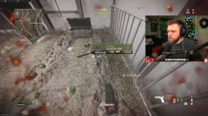
I can quickly snag it up without having to look through the pile of loot on the floor, which often ends up accumulating once you've killed a couple of players. Just by changing the outline colors of these items from white to their corresponding rarity items. I think you could greatly improve how quickly players can identify things they need and how quickly they can pick them up or not pick them up and crack on with a game ahead of them.
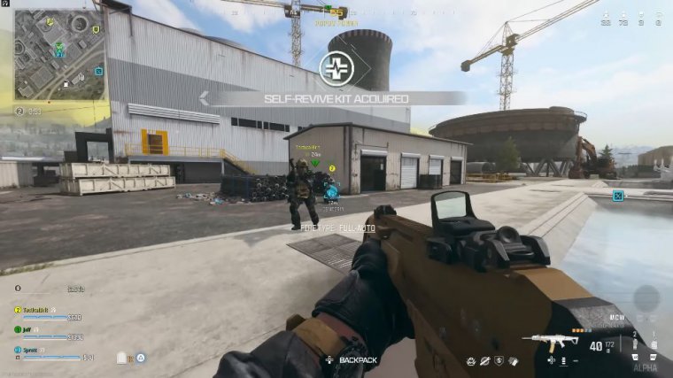
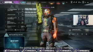
The fourth big thing for me is lighting. Now I'm happy to report that, for the most part, from what I experienced in Erston, the lighting seems very good, and you can see most opponents very easily. But there are a few skins in Call of Duty right now, including this ridiculous Groot skin that would be impossible to see on this map, and the last thing anybody wants in the brand new version of War Zone is to drop into their first game of War Zone and be frustratingly killed by a player that they physically can't see now, whether you change the skin or apply artificial ring lighting to individual player models so that they're more easily identifiable.
Whatever it is, it just needs to happen. We can't have it on day one of War Zone 3.0, so to speak, people being dragged on by skins that they physically can't see, doubling back to the movement, and this is something that I feel has to be mentioned again. Zip lines are another area that I feel needs a little bit of work, especially the horizontal zips.
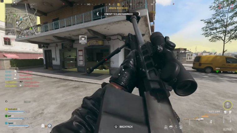
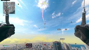
I was almost surprised at how slowly horizontal zip lines move because I was expecting them to move a lot quicker. I feel like having them be a little bit more rapid would incentivize them to be used a bit more aggressively, which is good for the game, but I also want to talk about the general player movement.
There's a lot of equipment in Modern Warfare 3, which adds a bit more mobility and movement to the existing gameplay, like the ability to aim down while sliding and the ability to move in and out of those slides a bit more rapidly. And whilst we know equipment isn't transferring to War Zone and that they're sticking with perks, it would be very useful if War Zone adopted a universal gameplay that they were happy with, for example, being able to add ads while sliding.
In my opinion, this just should be a default; it shouldn't be something that you have to have a certain thing for, and that thing isn't going to be available in War Zone; it should just be a core fundamental of how War Zone operates. The next big thing I really want changed is the Ping system in the war zone.
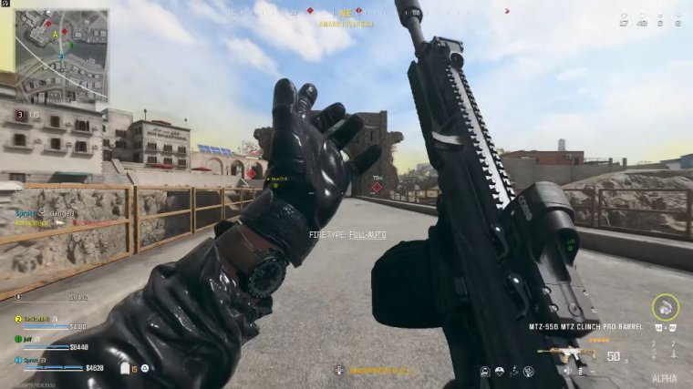
I was really happy to see that you can now set individual squadmate colors so that they appear in certain ways, which is a huge bonus, and I like that they've approached it that way, but the one thing I really wish we would see change immediately is how the Ping system works. So rather than right now where pressing up on the d-pad automatically pings the thing in front of you that you happen to be looking at, make it so that up on the d-pad pings the thing that you're looking at, and then even if you turn away and do a 360 into a different dimension and press that button again, it will automatically unmark the thing you just registered.
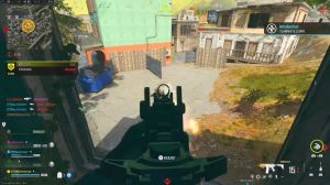
You shouldn't have to go into the map in the game to clear all of your pings at the same time. I just don't think that that's a good fluid system, and I feel like as helpful as pings are, they also contribute to a large amount of visual cluster in the game, and there's been a huge number of times as an individual player where pings have been so large, so frustrating, or so in my way that I just can't play the game properly or see what's in front of me, and this actually brings me nicely to my next point, and this is one thing that I think War Zone has needed for the longest time now: please declutter the UI and give us UI scaling.
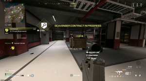
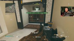
Let's change how big certain elements are on the screen. If I've picked up a weapon in a war zone and it's my own gun, I don't need a white PNG outline of what my weapon is. If I've already picked up my perk package. I don't need to see on screen what that perk package is all the time; it could just collapse away, and if I happen to pick up another perk package, maybe it appears on screen for a few seconds, then disappears.
Or if I access my backpack, those elements are just automatically on screen. Right now, I have so much on my screen for absolutely no reason, and I just don't see why they do this in the game, and I think it actually takes you out of the game. I don't need to see the name of my gun, the number of attachments it has, the PNG of the weapon, or the number of perks I have.
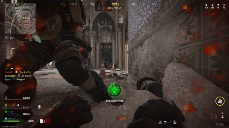
I don't need the compass to be as large as it is, and I don't need things like the circle timer to be as large as they are. Let these elements be customizable, and let some of them disappear when they should disappear. The last thing you want in War Zone is to take the player out of the experience by spamming them with lots of useless stuff on their screen.
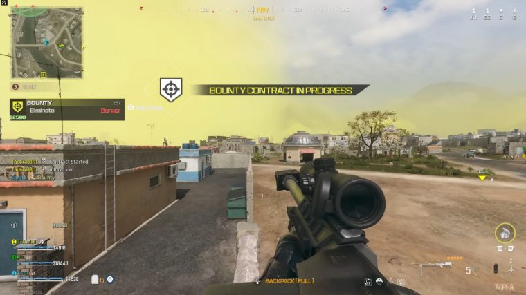
Player choice is always a healthy thing. If somebody does want those elements on screen all the time, let them set that option, but if somebody wants them to be collapsible elements on their screen, let them also set that option. I find the UI for Call of Duty War Zone sometimes a little bit lazy; for example, when you accept a bounty contract on a player, you have this gigantic yellow bar under your mini map that feels so unnecessary.
I know what a bounty is; I don't need to have it on screen all the time, and my final thing that I feel really needs changing is the gas mask system. It was really nice to see that you can manually equip gas masks in the new version of War Zone, but the one thing that annoyed me is that this is a multi-button operation.
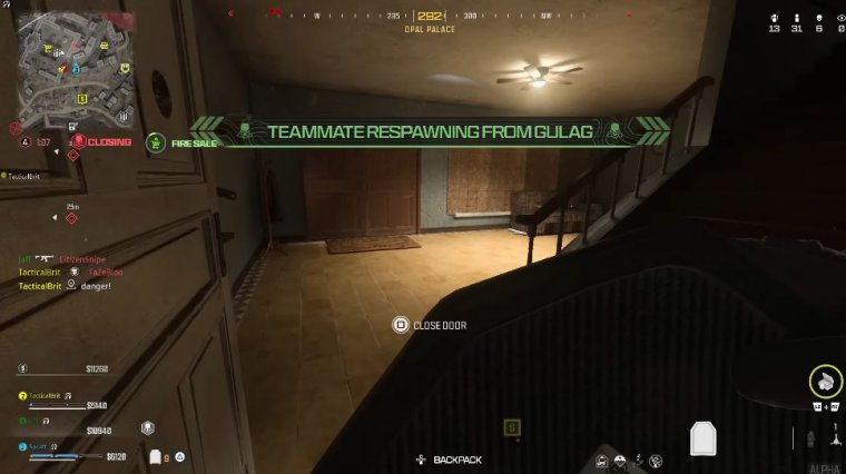
You have to go into your backpack, find the gas mask, and then press a button to put it on. Putting on a gas mask needs to be a single tap of a single button, and if that means rebinding something else that you don't use as often, then I think that should be the case, or if they want to reduce the amount of interaction you have to do with your inventory, make it so that when you go into your backpack, the first slot that is automatically detected is your gas mask slot, allowing you to press down and then one button to instantly put it on.
That would mean that having a manual gas mask is a really nice quality of life change, but it just needs a little bit more refinement to be something that will be less frustrating and easier to use in combat situations. And that's it. That's everything I have to say about the new version of War Zone.
Like I said.

 PREVIOUS Page
