News - Make Warzone 2 Look Perfect With Nvidia Filters. Maximize Visibility
Intro & installation
If you're looking for the best visibility and fidelity in Warzone 2, then you need to look no further than these Nvidia filters that I'm going to be covering today. Now, I will commend the developers for improving visibility since Warzone 1; it's a lot better here, but there are still major improvements to be made.
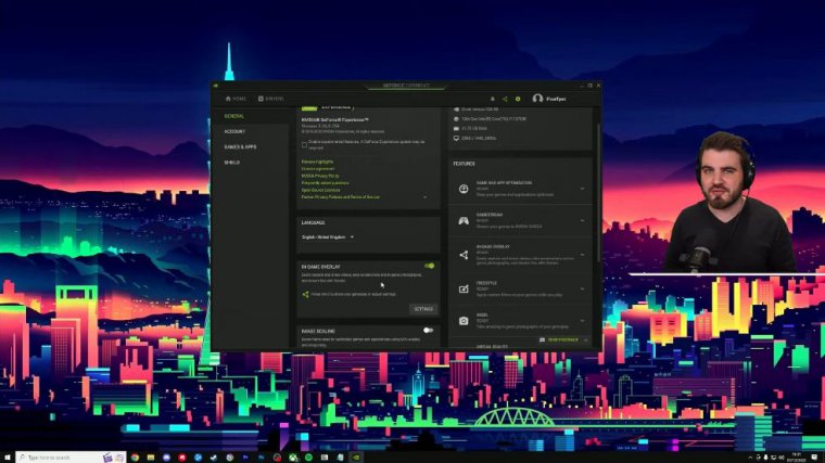
Nvidia filters are the best way you can resolve it all very simply, so before we can play around with any filters inside of War Zone 2, you need to enable them globally in the Nvidia overlay within the GeForce Experience application. The way you do that is to come down to the bottom right, where you should have an Nvidia symbol here.
Nvidia geforce experience should have come with your driver unless you've actively avoided using it. I'd recommend you go get it. Just right-click down here, and then you're going to go to GeForce Experience, not the control panel, and then in here you'll need to click the settings area, and you'll have the in-game overlay with a toggle here for me.
I've already got it on; you guys might not have it on you. You just need to make sure it's showing as green and the sliders are to the right; that means that it's on, and you can enable it within Warzone too by using Deep Fault. We're good to go, so let's now jump in towards N2 and begin playing around with filters now before we go any further.
Sponsored segment
Huawei, Microsoft Store, and even web browsers It's a whole football universe in your pocket, where you'll lead your club, create a stadium, and sign a team of superstars. You and your friends can even team up to win championships.
Together, once you've got your star-studded team, you then get to watch the live matches play out in stunning 3D in real time against other managers from all over the world, getting you as immersed in every moment as possible. With football being so massive right now, Top 11 is being played by 260 million players worldwide, with a rating of 4.6 stars from more than 5.5 million reviews.
There are endless funds we have including limited-time events, competitions, and prizes happening during this Top 11 season to celebrate this special period in football, so be sure to join right now.
Enabling in-game
DMZ is going to be better than Battle Royale because you've got more time, you've got a circle chasing you, you haven't got people with a bounty on your head, and it's just going to be a much easier experience. You need to make sure you're actually in games, that you can see the game you're going to be running around in, get a good view, and then we can play around with the Nvidia filters.
So to open up our Nvidia filters, Alt Zed, and DMZ, Then you're going to click the game filter on the overlay, and you'll get this area opened up over here. You've got three options: style one, style two, style three, or off. Off simply means it's turning off any of your saved filters, and then these style areas are where you can set up your sets of Nvidia filters as you want.
Brightness & contrast

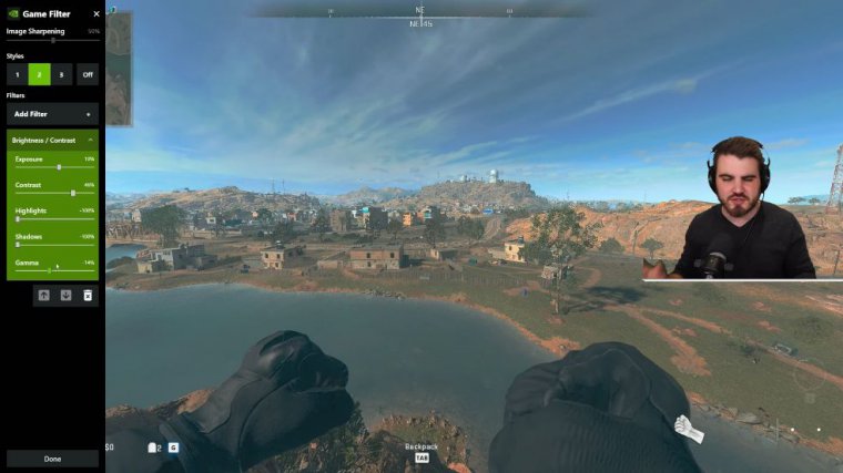
The first filter we're going to add is going to be brightness and contrast. This is going to be all about improving the overall The lighting in the game is not too bad to start off with, but there are still some dark areas and some areas where things are a bit too bright and overexposed, so open up brightness and contrast, and it will start doing something right away once you pull it in, but we're going to change these settings anyway first.
The first thing to do is grab your highlights and bring them all the way down to minus 100, and then bring your shadows all the way down to minus 100. You're going to be like, "This looks terrible," and yeah, it does. What we've done is flatten out the lighting overall. We've taken all the highlights, the really bright areas, and we've made them darker.
We've taken all the shadows, all those hidden dark areas where Rose skins can camp. We've not really got Rose skins, but we've got that new Lathi skin, which is basically the new Rose skin, and it's going to make them a lot brighter, so overall the lighting just becomes more of a contrast, which is why it looks so flat.
The way we're going to bring back some of the contrast is quite obviously with the contrast slider. We're going to bring this up to a starting point of around 4:40 to 4:50. I'm quite liking around 46. It just brings back some of that nice contrast without making the dark areas dark again and the light area too light again; it just makes the overall image look nicer than it did before, and then we'll play around with these exposure and gamma sliders.
The first one I'll touch is the gamma area, which I can actually find if you bring this down a little bit. It seems to keep things very nice and clear without actually bringing down the overall brightness too much, so I've found that somewhere around -60 minus 14 works really nicely on my monitor.
You need to play around until it looks nice for you, and then for exposure, I found leaving it at 10 as you suggested works pretty well; I don't feel like I need to change this setting. Up the contrast, highlight shadows, and gamma like this, and we're getting some really nice uniform lighting overall across.
Colour
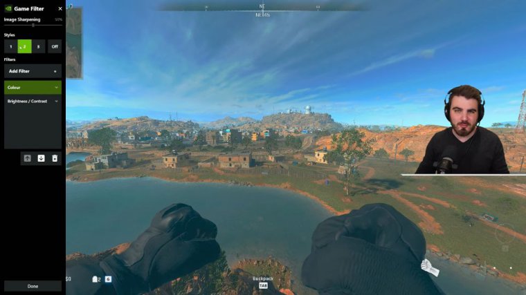
Next, we're going to tackle colors once again. I found that a tint color of 40 brings in some of the blues that are missing from the color palette of Almazro, but it's still going to look way too blue, so we're actually going to turn this tint, intensity, sorry, down to around ten percent.
It's just adding in a lot of the colors that we previously didn't have; it makes the overall map look a lot less orange. I know it's a desert, but this is going to level out the color palette overall and make it look just generally nicer to look at. Then, we're not going to touch the temperature, but we're going to grab the vibrancy, and we're going to bump this up to something around 60.
Once again, it's going to be personal preference how you like to have your colors and how much you'd like to have them pop, but this is going to make a lot of those oranges the predominant colors that we had on our before; adding the color is going to make them pop through, but we've still got the nice blues on top; it really blends it all together and gives a much better overall color palette for our mazar.
We've got one more filter to add, but just look at the difference so far. Flat colors don't pop; some bits are too bright, and some bits are too dark.
Details
We switched this on; it's nice; the flat colors are good; we're looking good, so The very next thing we're going to add is the details filter, and this really brings it all together. This is going to be a mixture of some sharpness and some overall clarity improvements, so the first thing we'll do is grab this clarity and bring it all the way to the right.


