News - Warzone 2i Looks Kind Of Ugly By Default. Beta Feedback & Color Correction Tips

I think by default, if you don't use any filters or color correction or anything like that. I think this game is a little on the ugly side, and honestly, even just a little bit of color correction goes a long way now before we really get into this. Of course, this is going to be a somewhat subjective article.
When it comes to visuals and art style, people's preferences will vary. Also, this is obviously not a major complaint that I've got with the game right now. I'm much more concerned with things that directly impact the gameplay experience and the actual mechanics of the game, but in saying that, it definitely doesn't hurt to make a game look a little bit more visually pleasing.
And I do think this is an area where there's quite a bit of room for improvement. I've seen a lot of people, especially now that the PC beta is live a lot of people showing off their different color correction settings that they're using, and I've been noticing that with a lot of these, the game has a lot of potential to look a lot better with even just a few minor tweaks to things.

And on that note, I do want to point out that with the game plays that you see on my channel, you're actually seeing some color correction in action. I do this directly through my capture card. I boost the saturation a little bit, I boost my contrast a little bit, and I also slightly drop the brightness on my capture card.
Therefore, if you're just looking at my game plays, you might be thinking this is a weird complaint. The game looks great, but that's because you're not actually seeing the native look of the game through my capture card, and to me, ideally, you'd want to make it look better out of the box so everybody gets to experience this, not just PC players that have the ability to use filters on their game or people that have capture cards like myself that allow us to make these fine adjustments.

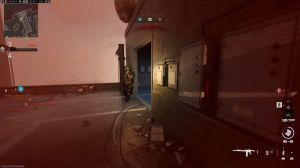
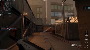
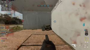
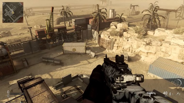
And getting into some details with this. I think the biggest issue here is that it just seems like there's a little bit of a haze on the map all the time, and with this, things tend to look pretty washed out, and especially when you start looking at somewhat longer ranges in multiplayer at least, this can actually affect character model visibility a bit as well, and I do think this was just an artistic choice of theirs where they wanted things to look a little bit more like gritty and realistic.
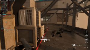
But at the end of the day, that's not the impression that I get out of this; the feeling that I get when I look at this is like being flat, washed out, and boring. Now. I do think this is an actual atmospheric setting that they added to the game because when you're in an interior environment, you don't see that same sort of haze or fogginess, and actually, inside most buildings in this game, the game looks significantly better than if you're outside the buildings, so Sledgehammer is open to adjusting something.

I think cutting down on that atmospheric fog a little bit would really go a long way toward making the maps feel a bit more appealing and less flat-looking. Now you can get around this a little bit through filters or color correction. By boosting contrast, they have a tendency to cut through that a little bit, so even if they don't make this adjustment, if you have the ability to put a filter on, bumping up your contrast setting does help with this area a bit.
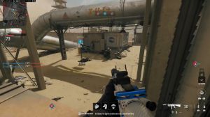
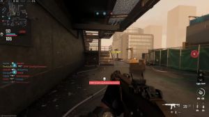
And saying that, though I'm not even sure if that would be enough, another thing I've noticed with this game is that it's out of the box. I feel like there's not a whole lot of color, even though many of the maps, like FLLA, for instance, should have a whole lot of color; those colors aren't really vibrant.
They don't really pop so much, and part of this might be tied to that previous thing I was talking about with that atmosphere at fog this may be muting the colors out a little bit more and if they were to just cut down on that maybe that would naturally boost the saturation and the colors a little bit but in either case I have noticed this is another area where when I boost my saturation even just slightly I try not to take it way overboard, like I see some creators doing, but even just a subtle boost to the saturation.

At least, in my opinion, it makes the game look significantly better as well, and honestly, those are the two biggest areas. If they were to make a couple adjustments, I think it could make a huge difference in people's perceptions of the visuals of this game. I mean, you guys have been seeing me kind of fade back and forth between some very basic Photoshop color correction, where essentially I'm just boosting the contrast a little bit, maybe adjusting brightness a little as necessary with that contrast, and then also slightly boosting the brightness or saturation a little bit, at least in my eyes.
This makes the game look significantly better, a lot more appealing, and more like somewhere I want to be spending my time, while it may not look quite as gritty or grungy as the native colors. Do you prefer the non-color, corrected version of the out-of-the-box colors that you're seeing or the color-corrected version of the images that I provided here to me?

The color-corrected images look significantly better than the out-of-the-box images. At least if we're taking a big picture, look at this. I will admit that with the color correction, sometimes it oversaturates certain elements just because there is that big discrepancy where there's some areas that by default do pop in a fair amount, but I was just trying to make some of the other colors pop for illustration purposes.
So I'm not saying it's flawless with this color correction. But I am saying a little bit of color correction can go a long way here. Since we're on the topic of things looking ugly in games, there's another specific thing I wanted to bring up in today's article. It has to do with, like, the color correction or anything, though in this case this is to do with the fact that we have the new feature in the game, and every single time I aim down sight, you have this big toggle tactical prompt, right toward the center of your screen, right on top of your weapon model, and I really don't like the looks of this.
It was handy to have at first, just to remind us of the fact that this is a new feature and something that you can do, but I'm over it. I know I can do this; I don't need to see that prompt every single time I aim down. At the very least, when it comes to this, I'd love to see an option to be able to just toggle this off so the tactical stance would still work for you mechanically.